Dataiku
Dataiku is a collaborative software platform, which enables you to explore, prepare, analyse, build, develop, deploy, etc. your own data.
Predicting Housing Value
This project is an in-class project using regression to predict housing price value in California.
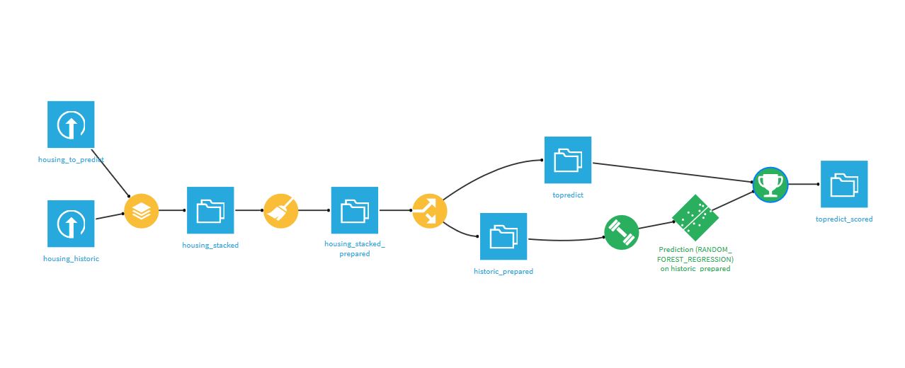
This diagram represents every single step made from loading datasets to predicting median house value for the "housing to predict" dataset.
Data preparation
We started by loading our datasets: Housing_topredict and Housing_historic, then we stacked them to enable similar preparation in both training and output datasets. Then, I went directly to the 'Lab' to create a Jupiter Notebook and plot the following graphs:
Python Plot
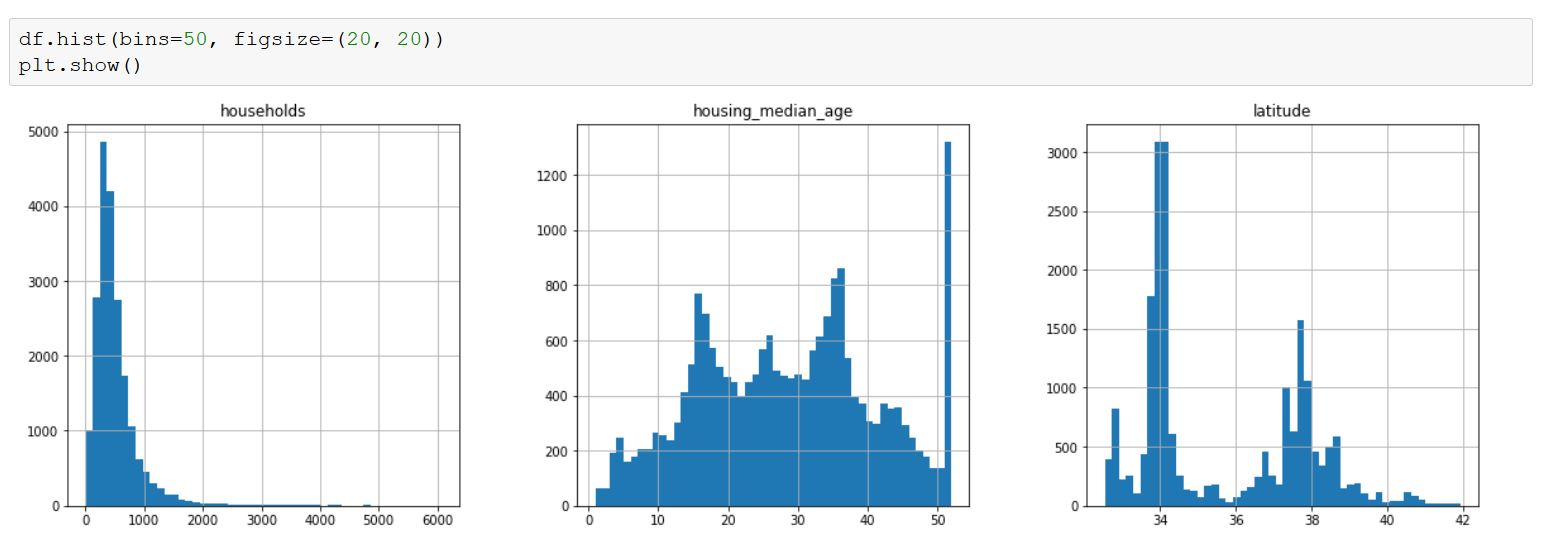
These plots are usefull to visualize your data and it allows you to see whether you need to scale them or not. Scaling is used when you have to deal with huge values as predicators (billions for example). Indeed, it could reduce the regression coefficient to a very small magnitude which would be very annoying to understand when reading your output (e.g 10^-9). Here, we did not have the problem but in some cases, it may be intersting to scale those variables.
Then, we created two columns:
- GeoPoint
- FamilySize
GeoPoint was made using a pre-prepared formula that allows you to create geopoints using latitude and longitude columns. It enabled us to make a scatter map later.
FamilySize had a little problem: When analyzing it we realized that we had extrem values, such as family size of 1200 people... We decided to fix this problem in later steps.
Correlation study
Now that we have prepared our data, we can start working on correlations.
Scatter Map
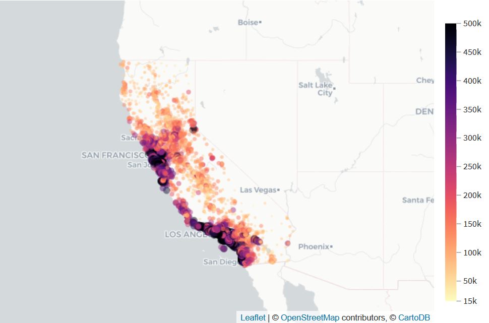
Here, we made a scatter map using 'GeoPoint' and 'median_housing_price_value'.
This confirmed the correlation between housing price value and the location of houses.
Indeed, we can clearly see that the nearest the house is from the ocean, the most expensive it is.
Scatter Plot

Here, we made a scatter plot using 'median_income' and 'median_housing_price_value' as X and Y. Moreover, we added the 'ocean proximity' in the color.
This confirmed the correlation between housing price value and the median income of the area: the higher is the median income ; the higher is the price value of housing.
Besides, the colors representing location confirmed the previous map : the closest from the ocean ; the more expensive it is.
Split and train
At this point, we still had to remove the extrem values on our FamilySize column. For this, we limited the values of this column to 5 times the IQR (Inter Quartile Range). We lost 51 rows doing this, but we got rid of the extrem values.
Then, we splitted the data into historical data and to predict data by filtering the rows where _median_housing_price_value_ was defined. This enabled us to have two different datasets: one to train our model, and the other to predict the price value.
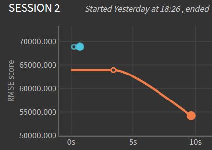
Before training models, we chose to output the RMSE (Root Square Mean Error) metric. Then, we trained the model using 'Quick models' from the Lab.
On this graph, the blue line represents RMSE for the Ridge(L2) Regression model, whereas the orange line represents Random Forest training model. We can see here that Random forest has a longer computing time, however, it is a better model for predicting housing value since its RMSE is lower.
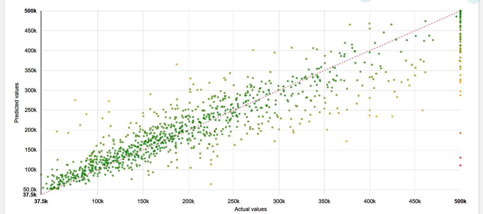
This scatter plot enabled us to see the correlation between predicted values and actual values. On this graph, the closest is a point from the line ; the smaller is the error in prediction. Since points are well partitioned around the line, we can say that the prediction is rather well made. Therefore, we chose this model for predicting median house value on 'topredict'.
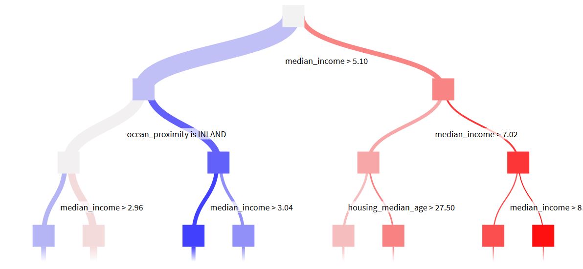
This decision tree is one tree of the random forest. It confirmed our correlation study: two of the most important variables were : median income and ocean proximity. This was also confirmed by the result page of our training.
Deployment and prediction
Finally, we deployed the model and applied a prediction recipe using Random Forest. And this is how we got our final result: topredict_scored.
To present the project, we created a WIKI (a document explaining our work) and we published it on the dashboard with the previous graphs.
This project was one among three differents ones on Dataiku, which I selected because I had already mentioned other projects using classification and I wanted to develop one regression model.
IBM Watson Assistant
Coffee-bot
Coffee-bot is my first Chatbot. It was made in class using IBM Watson assistant. It deals with coffee related questions: ordering a coffee, asking for the price, menu or nearest café.
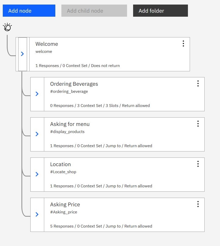
In the video, you can see short conversations with Coffee-Bot, whereas on the dialog diagram you can see how each intent is ordered to enable Coffee-bot to understand your request and answer properly. As you can see, each sub-question (price, location, menu) 'jumps back to' ordering a beverage. This was made on purpose to incite users to order something.
