Tableau
Tableau is my favorite tool when it comes to data visualization. I know that some people prefer Power Bi because it allows you to download many different types of graphs, but personnaly I rather use Tableau since you can (almost) always create your chart on your own.
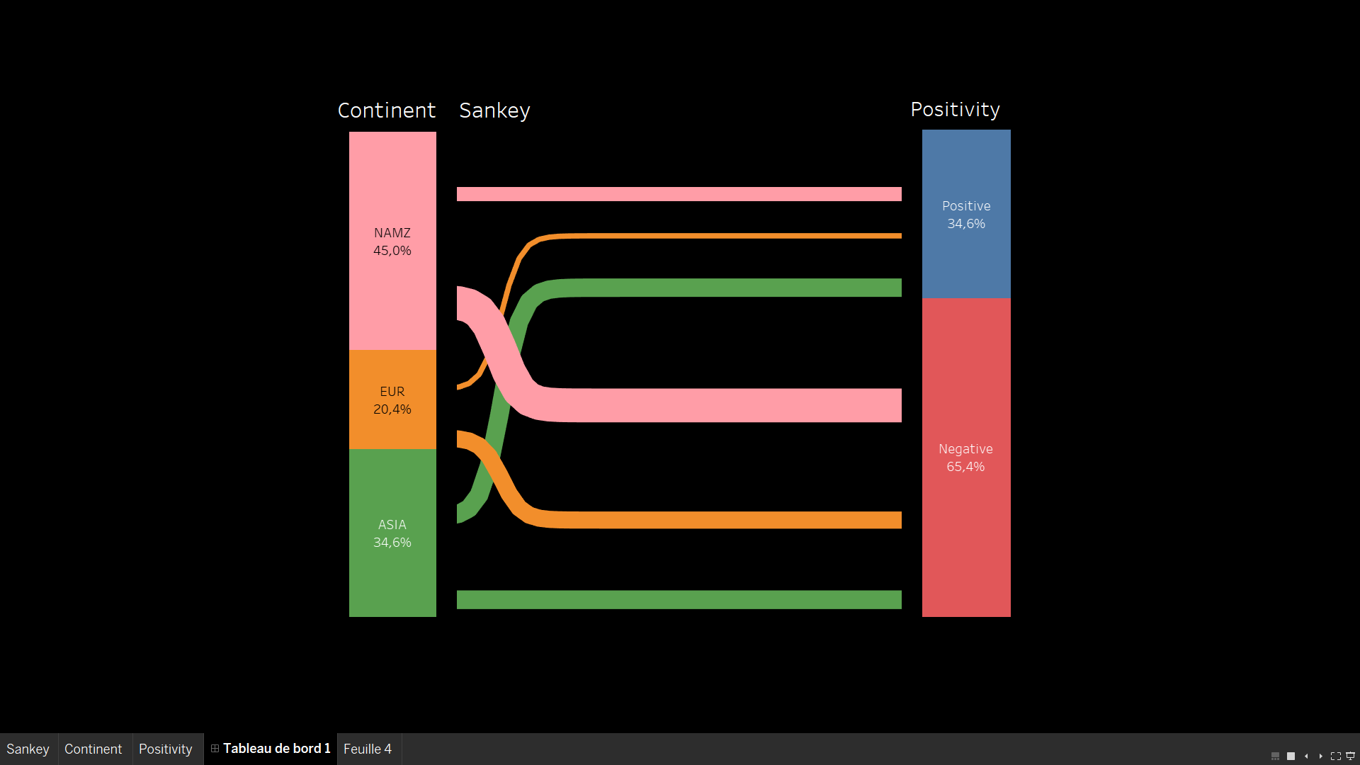
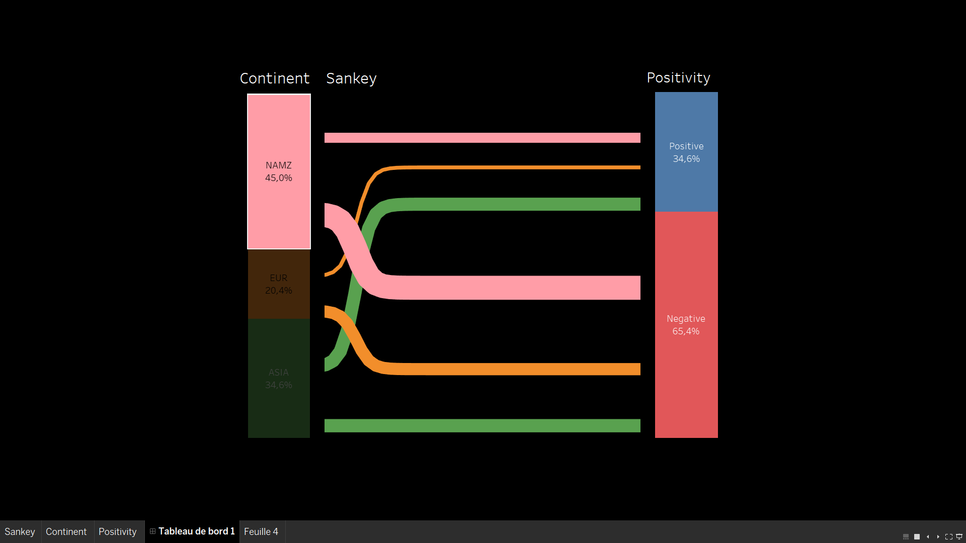
Sankey Chart created on Tableau
Sankey Chart using 'hover' action
Here, you can see a Sankey Chart created on Tabeau. It often requires to edit your dataset and double it. For this specific chart, you need to create each part (left side, center, right side) apart and then, you gather them into a single chart in the dashboard. It is not very complex, but you need to create many bins and calculated fields, therefore, it requires a little bit of technique. This example was used for a sentiment analysis, in which I was trying to highlight the impact of each continent on the overall negative sentiment towards the brand.
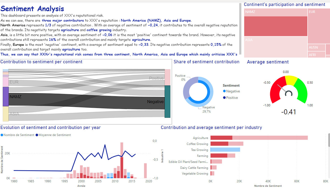
Sentiment Analysis
This project was given by our data visualization teacher and the goal here was to find the reputational risk of a compagny. As the data where considered private, I have made this project anonymous. In the video below, I am shortly presenting my work on this specific project.
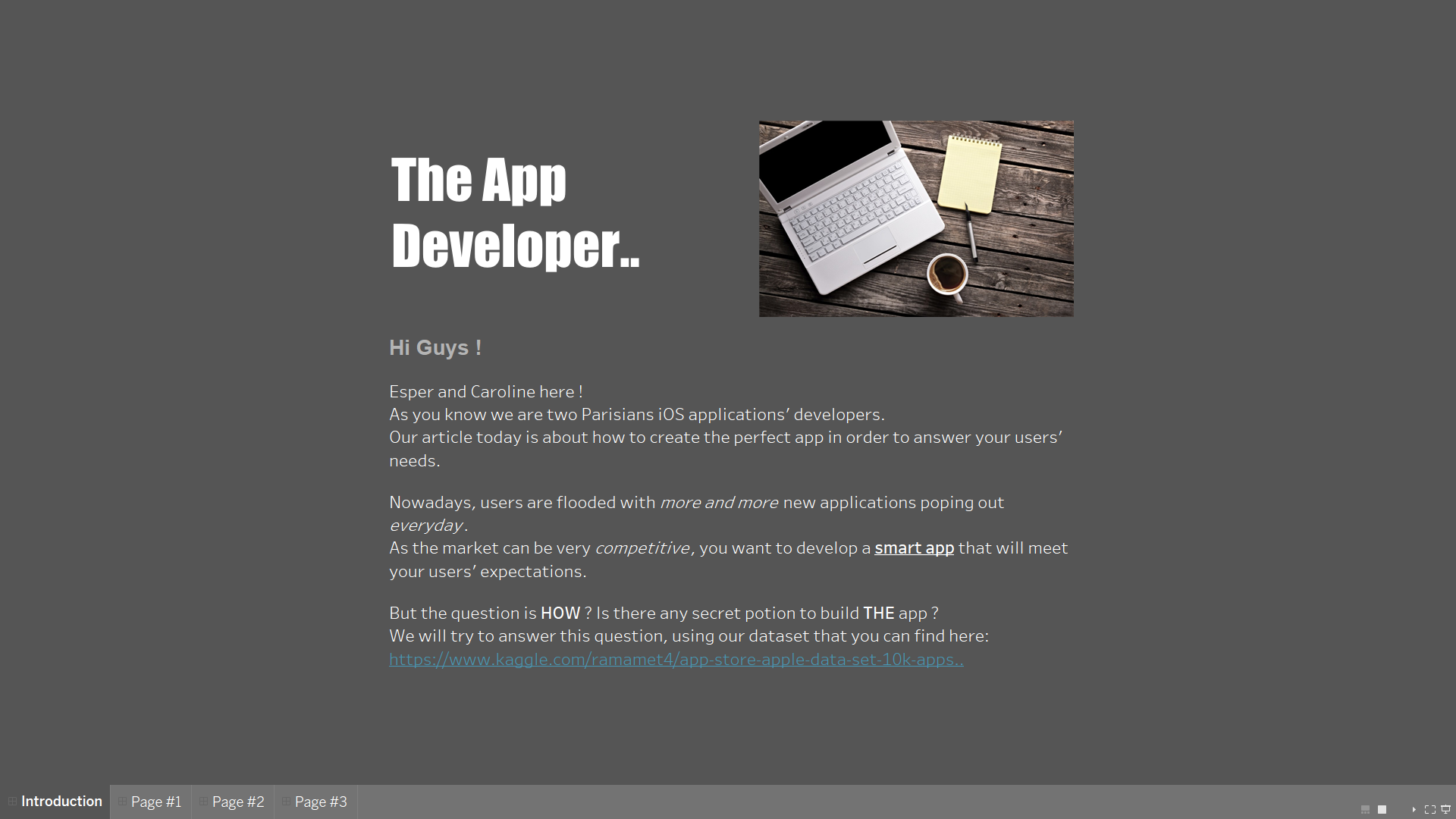
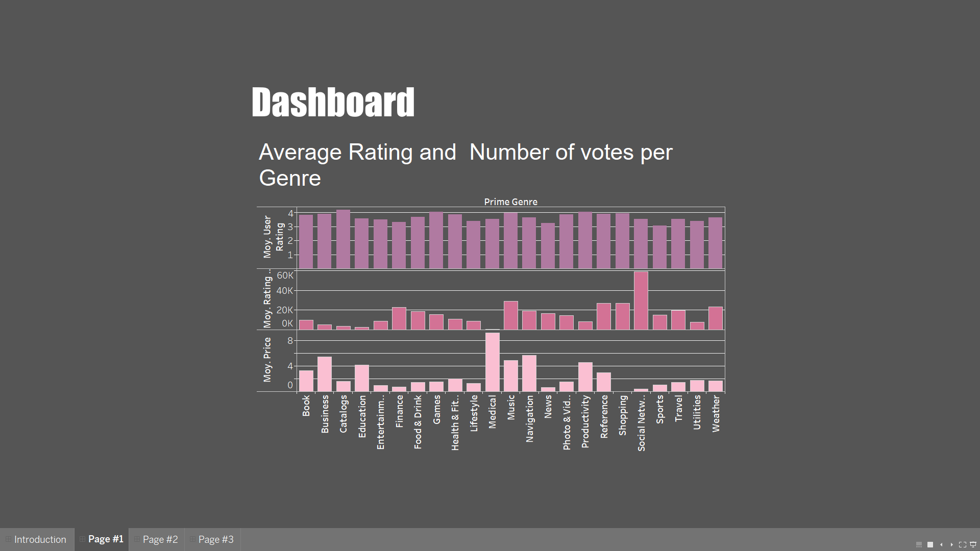
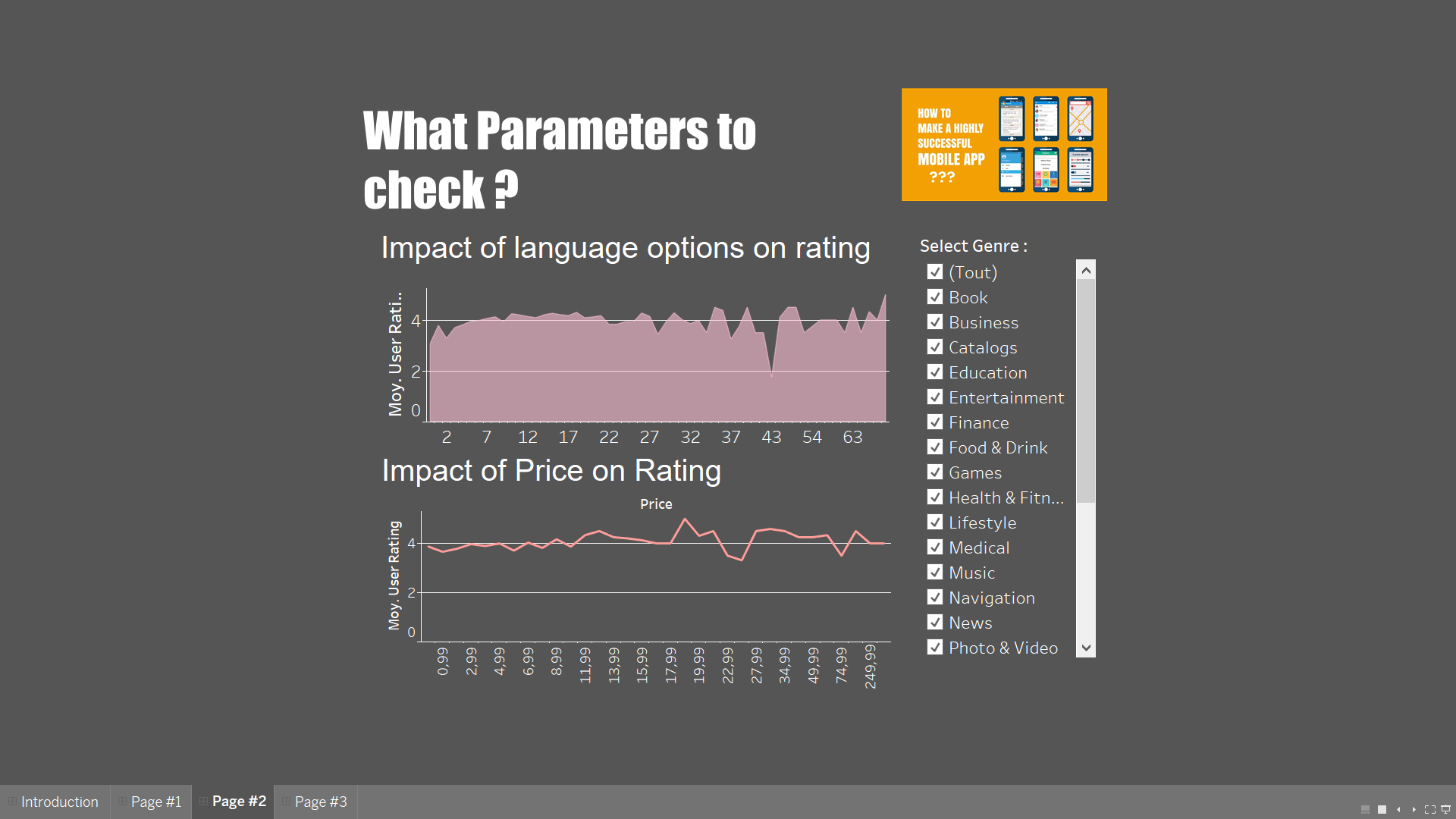
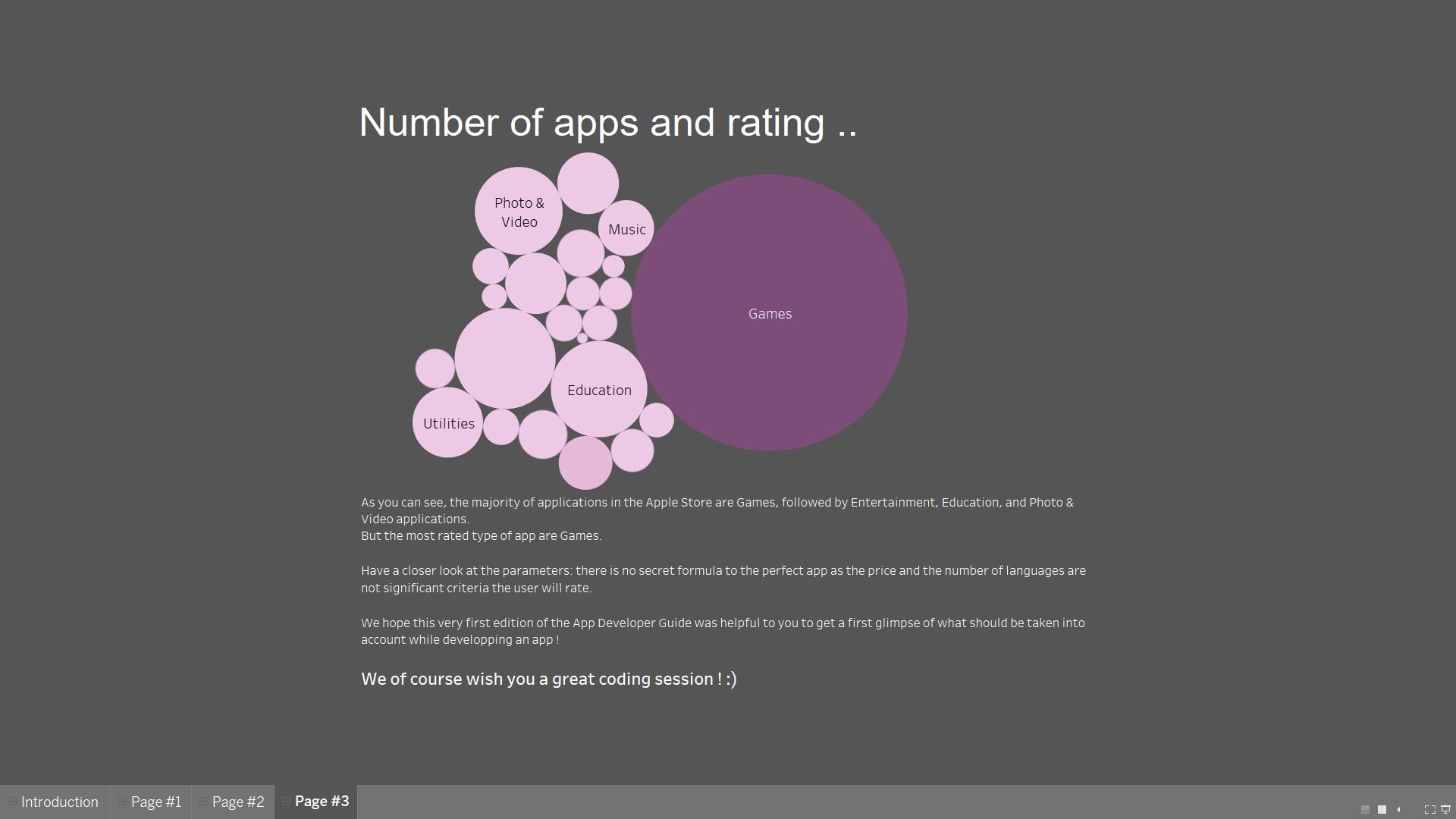
The App Developer
This project was another school project to discover Tableau. It was our first project with the tool, therefore it is simpler but very different. This project was a group project and I share the credit with a classmate !